The "bigBed file generator" interface has been uprooted and moved to the "Apps" list. On floating toolbox click button :
See that bigBed generator is listed as one option here and has got a gear icon. Click the option to invoke the function interface and use it as described before:
The scale bar and ruler have been sitting on top of genome heatmap for quite a while. They couldn't interact with user in any sort of manner, except for providing some minimum information like map position and scale.
Now we're in 2012, things are changing. First of all, the scale bar can be used like a real ruler. Following is its appearance:
On the left of scale bar you can find length of spanned region. You can move the scale bar around by dragging on it:
Dragging won't change span of the scale. To change it, use the downward arrow on the right side. Drag and move it horizontally to change span of the scale bar, the spanning length will update at mean time:
In this way, you can use scale bar to measure length of a region, just like using a ruler.
And about the ruler, it can be used like ... chromosome ideogram. Same as using chromosome ideogram, you can do zooming in by dragging on the ruler:
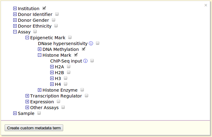
The metadata vocabulary is a very useful component of our Browser. It organizes hundreds or thousands of data tracks in a meaningful way, underlies the metadata color map, and allows creation of custom entries. Before this date, the metadata system hasn't been well designed -- repetitive components and duplicative code, cluttered user interface and rigid usability.
Now it has got a complete redesign! Highlights are following:
New interface to a centralized metadata user interface, allowing you to browse and manage metadata at one place. Code duplication and forking has thus been eliminated.
Editing metadata for custom bigwig tracks.
1. New metadata management system
At control panel of the Browser, click tab "Metadata" to find the metadata browser panel:
Shown are root level terms of metadata vocabulary of human database. Click on a term to navigate through the vocabulary:
Check a checkbox to have the term displayed as one column in metadata color map:
Above described components are related to Browser-provided metadata vocabulary. The lower component is related to custom metadata. Click button to launch the function:
Just fill up the blanks as instructed in the example:
Press button to make the new metadata term:
And check the checkbox following "my friends" to display the term in metadata color map:
The custom metadata terms can be saved in session function.
2. Annotating custom bigWig tracks
At control panel, go to "Tracks" > "Custom track", and click tab "bigWig" to show the custom bigWig track submission panel:
When submitting a custom bigwig track, you can make metadata annotation to it, and this step is optional. You can always add or edit metadata annotation at a later stage.
Click button , the metadata management panel appears:
Open up the vocabulary tree and find terms to annotate the custom track. Only leaf-level terms can be used by checking the checkboxes, the term will be displayed in a new table:
You can select an attribute from the custom term we created above to have it displayed in this table:
Notice the difference of how server-provided and custom terms are presented in the table. Click X to remove term from the table.
Click button to submit the track. Here we give it a dummy name "aa bb". Right click on the track in genome heatmap and option "Edit metadata" can be seen in the menu:
Select the option to open the metadata editing panel in floating toolbox, the existing metadata of this track will be shown here:
You can repeat the same procedures to add or remove metadata entries for this track. The metadata color map will update on the fly.
So Google has just updated their Chart API (specifically, some minor changes with DataTable). And that breaks chart rendering in Gene Plot function... I just updated the Browser code and now it complies with the changes, and yields charts with a slightly new appearance.
Above example is first plot type. A grid in gray lines appears in the plot, hope you don't mind... And you can press on a data point, sort of stamping. Same thing applies to plot types two (multiple curves) and three (gene segments).
= = =
By the way, it is now possible to sort gene set using data from quantitative genomic feature track. Here's the interface:
The second button is newly added here. Click to use:
Here in this example "GC percent" track is selected. Note all the other positional tracks (like CpG island, genes) turns gray means that you should not select them. Only quantitative tracks should be selected.
And here's the example of sorting genes using average GC percent (ascending order):
The Gene Plot function has previously been designed to work primarily downstream of Gene Set View. It takes genomic coordinates used in Gene Set View to do the plot. It also has been extended to work with custom bigBed track, where all coordinates of bigBed track can be used in Gene Plot.
Now Gene Plot can be run like a standalone App, so that you can easily make a plot using list of genes or coordinates. Launch it by clicking button in floating toolbox and select the option:
The Gene Plot panel will now be displayed as a floating panel on top of Browser page (partially shown):
In addition to old steps 1-2-3, "Step 0" is added here, where you can specify positional data for the plot. Its usage is entirely same as Gene Set View interface.
Once positional data is specified, continue with remaining steps by choosing data track (step 2), choosing plot type (step 3), and rendering mechanism (step 4). Push button to run Gene Plot. After a short while the plot will be displayed in a new panel.
Following previous post, select and launch Bird's Eye View via option from floating toolbox:
The Bird's Eye View interface panel will be displayed on top of page:
In the beginning, no data is been displayed in the View Panel, and this is indicated by "No data on show" on top of panel.
At this step you can add and display tracks in the View Panel. To add a heatmap track, press first button:
The heatmap track selection panel appears prompting you to make selection. Select one and it will be displayed in the view:
Once some data has been displayed, a button will be displayed instead. Push it to show the list of tracks available in the View Panel:
Finally, you might be wondering where is the large wrench button. It has been moved into the View Panel, on the header line. Click it to show the configuration panel in floating toolbox:
As indicated, you can configure appearance of View Panel using the options here.
= = =
Still substantial amount of work need to be done to make this function better. First of all, as statistical tracks can run in the framework of Bird's Eye View, however they don't work with chromosome resizing, that's what the option "Width of longest chromosome" does. Right now when you resize chromosomes, statistical tracks will be removed to avoid error. This is certainly inconvenient, but as a complete code revision is required to make this desirable feature possible, this takes a bit of time, and I beg your pardon on this.
The other more fun and challenging stuff is to support metabolic pathway in Bird's Eye View. The words on top left corner "Display data on whole genome" reserves place for this function. In the future an option looking like something below will be deployed here:
Display data on
By this you can switch view by one mouse click and view profile of your data on hundreds of pathways, how exciting that would be! But first I need to sort out some technical details like whether to host local copy of pathway database or do real-time query, and whether to use plain row display or network charts.