The Human Epigenome Browser specializes in visualizing quantitative data. But the solution was not good -- it only displayed tracks with positive values. It could be fine with slightly processed DNA sequencing data -- such as read density, peak calls, where all values are positive. But deeply processed data could have negative values. By fixing this problem of the Browser, a generic interface has been developed to allow user to control the style of all quantitative tracks in a consistent way. And the code got cleaned up as well.
By "quantitative track" I refer to a range of track types, so the configuration options described in this post applies to all of them, with different flavors:
To begin with, right click on genome heatmap and select "Configure" option, following panel will show up in floating toolbox:


By "quantitative track" I refer to a range of track types, so the configuration options described in this post applies to all of them, with different flavors:
- genome heatmap tracks
- numerical genomic feature tracks (e.g. GC percent, conservation scores)
- feature density of genomic feature tracks
- read density of custom BAM tracks
- pairwise comparison log-ratio tracks
- hypothesis test P-value tracks
- all the Bird's Eye View tracks
To begin with, right click on genome heatmap and select "Configure" option, following panel will show up in floating toolbox:
Let me explain things here, top to bottom:
Red and blue color blobs
These controls rendering color of the track, and positive/negative value colors will be determined separately. If the track is in heatmap mode, this color will be used for max/min data points. Any data in between will have lighter color. The baseline (at 0) color is always white. If the track is in wiggle style, the color is just bar color.
Click on the color blob, the color palette will be displayed near the cursor where you can pick up a color.
automatic/fixed/percentile scale
This option determines the scale. The first option "automatic scale" always set scale using max/min values. But if all the values are uniform (positive/negative), a 0-baseline will be enforced.
You can set fixed scale using second option, check it and the control panel will change a bit:
You can enter min/max values for the scale and press button to set that. Also in the color blobs two additional ones are shown, making things look complicated. They are colors for values beyond threshold, and this is actually very useful, as arbitrary combination of above/below threshold colors is made possible (which was impossible with the past design).
In the example below, values below max (which is set to be 30) will be bright red, and >= 30 it will be dark red. The tracks don't have negative value so blue color is not used:
The third option is actually what has been always used in the past: percentile threshold. Check it and the control panel will become:
There are still composite color blobs, means track values could be beyond threshold. The threshold now will be dynamically determined at a fixed percentile, and it is effective in getting rid of outlier values. Move the arrow above the ruler to select a percentile. Or you can click '>' '<' characters to increase/decrease percentile values (and it should work on your iPhone).
log transform
Will take logarithm of the track values. This is designed to be applied to ratio and P-value tracks. But you can apply it to wherever possible. Check the checkbox, options will appear for you to select base for the logarithm:
Above example shows applying log10 transform to MRE-Seq read density tracks (in heatmap style). Value below 1 will become negative and are plotted in blue.
Track height
Just the height of track. An implicit function is controlling heatmap/wiggle rendering style. If one track's height >= 20, it will be rendered as wiggle tracks, otherwise, it will be heatmap style.
apply to all tracks
This option is available if you are configuring heatmap tracks or bird's eye view tracks. If it is set to true, any subsequent change you make will be applied to all heatmap/birdeyeview tracks.
Following contents demonstrate how such configuration scheme applies to other types quantitative tracks, first of all, genomic feature density:
Genomic feature density
Example shows configuring SINE element density data. As genomic feature density value can only be positive, only one color blob is displayed. And in order not to add mess, the log option is hidden. Just let me know if you're angry with it...
Quantitative decorative track
Example below is sequence conservation score track computed by PhyloP program. Both positive/negative color blobs, and log option are available for this type of tracks:
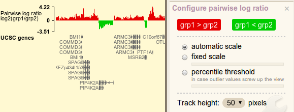
Pairwise comparison log-ratio
Red/blue color blobs controls bar color. Notice how the words change inside the blobs. As ratio values are always transformed by log2, logarithm option is not displayed.
Hypothesis test P-value
P-values are always between 0 and 1, and to emphasize those insanely small values, log10 transform is applied. Resulting values are all negative, and bars all point down... Don't scold me this is just things should be...
A horizontal line can appear in P-value track to indicate where cutoff value is. In the example it indicates the vertical position of 0.05. Bars stretching beyond the line are P-values lower than the cutoff, thus to be considered *significant*. Options are available in the panel to change cutoff value and line color, and the change will take place in a blink.
Bird's eye view tracks
All above track types can be viewed at the view angle of bird's eye, and can be configured in same manner. Following is such an example:
I'm glad to hear your opinion on these, just leave a comment!
No comments:
Post a Comment