Updated on Feb 8, 2014: This feature has been dropped.
Today we release a new feature, the "overview wiggle track". Let's take a quick look here.
Open the browser, select a species (I'm choosing "human" here), the page will be loaded up as usual. Something new appeared on top of small chromosome ideogram: a wiggle track.

By default the small wiggle track is in some obscure color. With a close inspection you'll be able to tell it's the "UCSC genes" track, showing gene density of current chromosome.
Press cursor (LEFT but not right click) on the track will invoke a context menu:

Select "configure" option if you are unsatisfied with the wiggle's rendering style. A familiar looking configure panel will open up in floating toolbox:

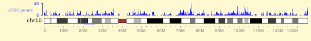
Below is the new look of the wiggle track, with color changed to blue, and height increased a bit:
With the "replace" option in the menu we can change content of the track:

A sub-menu is displayed prompting you to select track from either "heatmap" or "genomic feature" category. Choose either one, the corresponding track selection panel will be displayed. Upon selection of a track, the wiggle plot will update. Both native and custom bigWig and bigBed tracks can be displayed (density counts will be shown for bigBed genomic features). However BAM tracks are not supported for the moment.
If you are happy with that, you can go on with your browsing. The wiggle plot would update at appropriate conditions. Following is the case when the displayed region spans multiple chromosomes. Wiggle plot automatically extend its coverage over those chromosomes:

This might sounds like crazy and is indeed rarely useful in the context of genome browsing. But this would be really useful in case of Repeat Browser where user would be constantly browsing data over multiple repeat subfamilies for comparison purpose. We hope you'll see such things happen in a few months.
And during Gene Set View, the wiggle plot will update again. Following example shows wiggle plot of some H3K9me3 data over KEGG's glycolysis pathway. It is seen that two genes in that pathway carries extraordinarily high H3K9me3 marks.

And finally you can add another wiggle plot to be plotted beneath ideogram bar. Here I add a H3K4me3 track of same sample (CD34 primary cell) as the H3K9me3 track:

It looks that H3K4me3 mark is more dispersed than the H3K9me3 mark here, and the two marks don't correlate with each other.
In general, this small function presents data pattern on a wider scale, and hopefully provides some kind of guidance for your browsing.
Today we release a new feature, the "overview wiggle track". Let's take a quick look here.
Open the browser, select a species (I'm choosing "human" here), the page will be loaded up as usual. Something new appeared on top of small chromosome ideogram: a wiggle track.

By default the small wiggle track is in some obscure color. With a close inspection you'll be able to tell it's the "UCSC genes" track, showing gene density of current chromosome.
Press cursor (LEFT but not right click) on the track will invoke a context menu:
Select "configure" option if you are unsatisfied with the wiggle's rendering style. A familiar looking configure panel will open up in floating toolbox:
Below is the new look of the wiggle track, with color changed to blue, and height increased a bit:

With the "replace" option in the menu we can change content of the track:
A sub-menu is displayed prompting you to select track from either "heatmap" or "genomic feature" category. Choose either one, the corresponding track selection panel will be displayed. Upon selection of a track, the wiggle plot will update. Both native and custom bigWig and bigBed tracks can be displayed (density counts will be shown for bigBed genomic features). However BAM tracks are not supported for the moment.
If you are happy with that, you can go on with your browsing. The wiggle plot would update at appropriate conditions. Following is the case when the displayed region spans multiple chromosomes. Wiggle plot automatically extend its coverage over those chromosomes:

And during Gene Set View, the wiggle plot will update again. Following example shows wiggle plot of some H3K9me3 data over KEGG's glycolysis pathway. It is seen that two genes in that pathway carries extraordinarily high H3K9me3 marks.

And finally you can add another wiggle plot to be plotted beneath ideogram bar. Here I add a H3K4me3 track of same sample (CD34 primary cell) as the H3K9me3 track:

It looks that H3K4me3 mark is more dispersed than the H3K9me3 mark here, and the two marks don't correlate with each other.
In general, this small function presents data pattern on a wider scale, and hopefully provides some kind of guidance for your browsing.
No comments:
Post a Comment